Have you ever clicked through to a website on your phone, only to find yourself rotating the screen and zooming in (or out) a ridiculous amount just to make the font legible?
Chances are, that brand is rocking an ancient website that doesn’t implement any responsive design elements. Responsive website design takes into account that today’s customer can be looking for you on just about any device – their desktop computer on their lunch break, their phone on the way to work, their tablet on the couch with a glass of vino – and makes sure that your site looks great on all of them.
Today’s responsive design principles have gone beyond just smushing your desktop website to fit a phone screen (thank the lord). Let’s take a look at best practice for responsiveness and how to implement it with a custom website design.
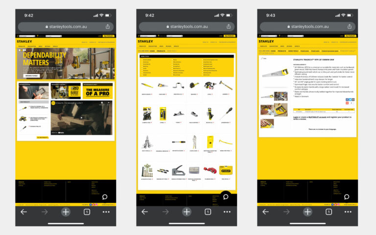
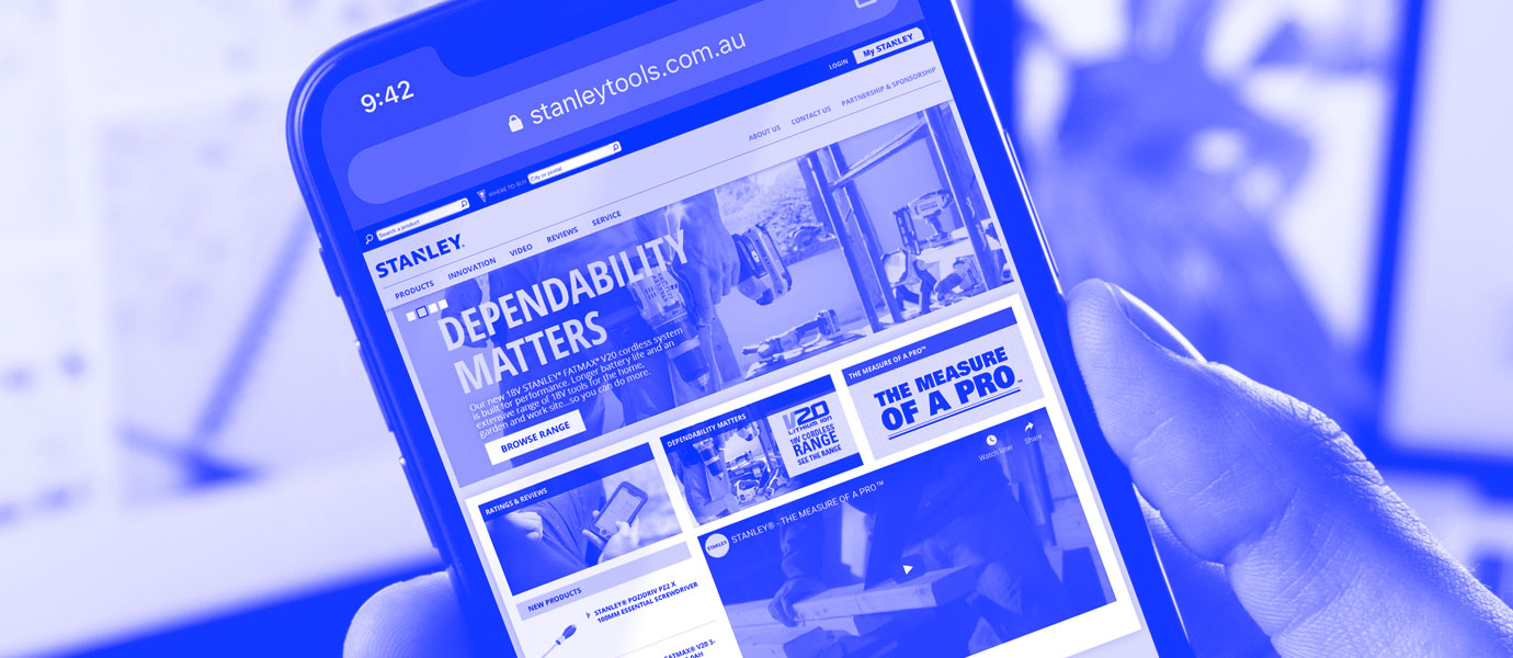
We don’t want to call anyone out, but its surprising how many large brands don’t have fully responsive websites…
Why is responsive website design important?
One of the most glaringly obvious reasons you’ll want to invest in a responsive design for your website is to cater for the surging mobile audience.
Mobile traffic accounts for 73% of all eCommerce sales and counting, so if your site doesn’t cater to these users? You’re ignoring almost three-quarters of your potential customer base. Not a great first impression in our book, and if your competitor’s website is easier to navigate (and easier to purchase from), then you’re basically sending them free traffic.
It’s not just humans who want responsive design, either. Google’s algorithms will look for a mobile-friendly experience as part of their rankings, so you could be hindering your SEO efforts without even knowing it.
Implementing responsive features in your custom website design
So, you’re on board the responsive train. The next step is to go about actually making your site responsive, and making the necessary changes to your design to cater for all devices.
Fluid grid vs fixed proportions
One big difference in a responsive website is how it distributes elements within the design. While earlier websites worked within a fixed grid, measured in pixels, today’s responsive websites are built to a fluid grid.
So, instead of elements being one fixed size, they grow or shrink in proportion to the size of the user’s screen. Heights and widths are scaled based on the screen size – no more weird font stacking or overhang, no pinching in on images to make them visible, just a great experience from the minute they hit your site.
Programs like Sketch and Figma have inbuilt, easy-to-use grid systems that let you build your design with responsiveness in mind, and to check that it looks good on a range of devices and screen sizes. Any good custom website design agency will design your site based on this principle, too.
When designing, keep ‘breakpoints’ in mind. This refers to the trigger for when your content will change to adapt for that particular screen size, providing the best user experience.
Common screen sizes
– Mobile: 360 x 640
– Mobile: 375 x 667
– Mobile: 360 x 720
– iPhone X: 375 x 812
– Pixel 2: 411 x 731
– Tablet: 768 x 1024
– Laptop: 1366 x 768
– Desktop: 1920 x 1080
But the most important and common screen size of all is 1440 x 1080 which is how design agencies like ourselves will present your website concepts.
Less is more
A common misconception around responsive design is that it’s a sized-down version of your desktop experience.
Best-practice responsive design prioritises user experience over everything else – and sometimes that means modifying elements of your desktop design, or even omitting them altogether to reflect the differences of the mobile browsing experience.
A great example of this at work is the site navigation. On a desktop, we’re pretty accustomed to a navigation panel spanning the top of the screen. Taking us to where we want to go in just a few clicks, the menu bar displays all options in one, clickable pane that’s omnipresent without getting in the way.
On smaller screens, however, to directly translate this element would mean either super-small font sizes, or multi-row navigation bars. Either way, not really user friendly.
Instead, responsive design has made the hamburger menu (or collapsed navigation) a staple. Users can click to expand the site navigation, providing that functionality without otherwise impeding their browsing journey.
Cursor vs touchscreen
The way someone interacts with a website via their cursor versus how they interact with a site using their finger is different. Sounds obvious, but stick with us.
On a desktop computer, for example, it’s common for a button to change colour when you hover your cursor over it. How do you do this for a mobile user?
Consider too the relative size of a cursor in comparison to a finger on the screen. Fonts and buttons generally need to be bigger (and more forgiving) on a phone – if your CTAs are too small to actually click, you’re just adding another barrier to purchase for a potential customer.
Testing your responsive design
We’re fans of Chrome’s Developer Tools for seeing how your live site design translates across different devices.
Press Command + Option + I on your Mac (that’s CTRL + Shift + I for you PC users out there) to access the Developer Tools from your Chrome browser. From here, you can select from a range of devices and preview what your site looks like on each one.
To test out your new design before setting it live, platforms like InVision and Marvel allow you to quickly create interactive prototypes of your proposed site.
Send it around to a few people who haven’t directly worked on the project as a form of user testing (bonus points if they’re in your key demographic). Make sure you design with extremes in mind – when it comes to fonts, for example, design for Grandma, not your Gen Z cousin.
Outsourcing to a custom website design agency
If you’re not already using a responsive theme on your eCommerce platform, or you’re not super savvy when it comes to coding, then outsourcing your custom website design to the professionals might be the answer.
A custom website design agency will be able to incorporate your branding and meet any specific needs you have for your online experience.
They can work within the platform that you’re already using, or point you in the direction of one that will future-proof your website and allow you to scale your site as your business grows.